
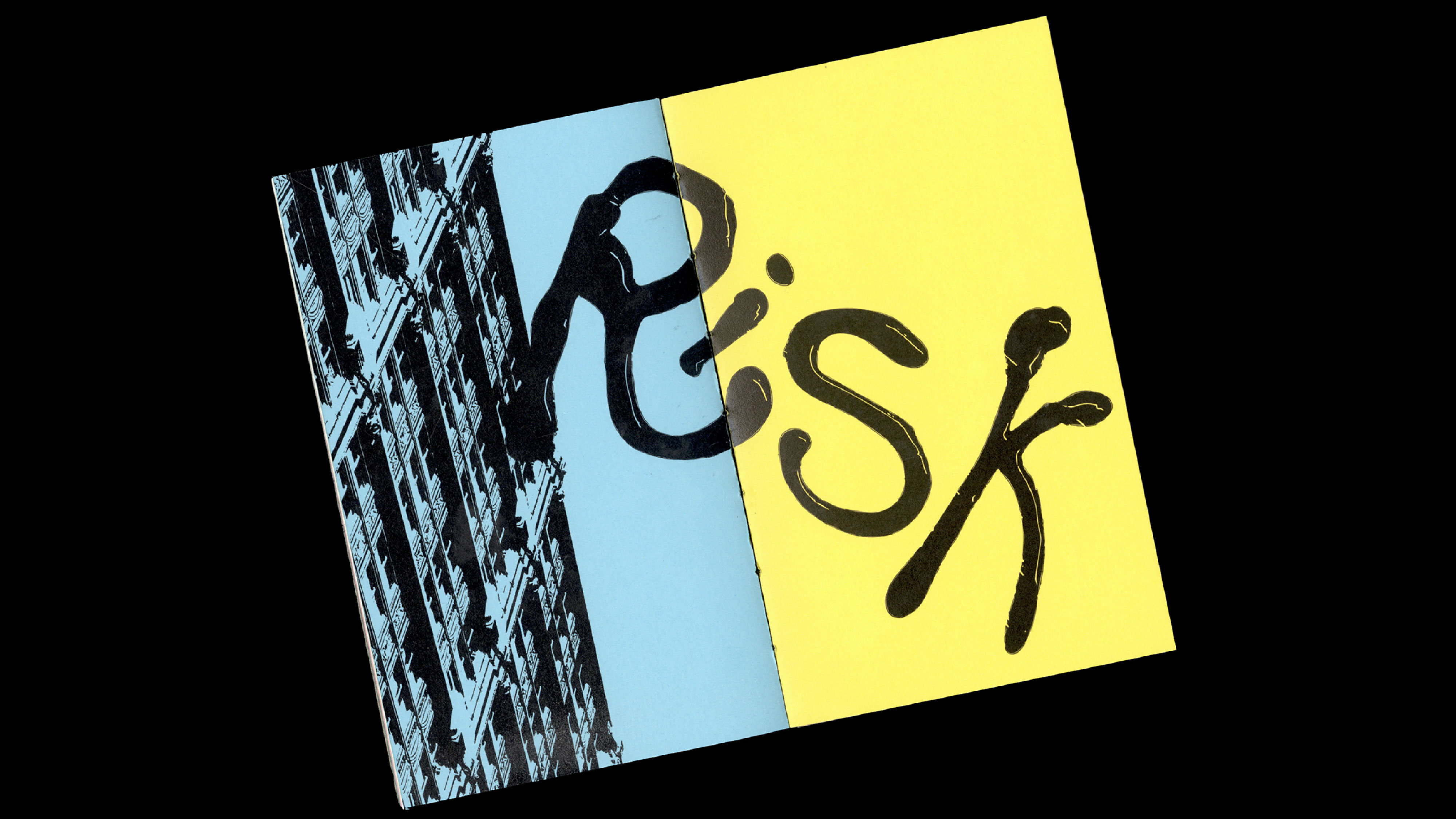
the risk issue
Dawson’s Graphic Design program teaches the fundamentals of design while encouraging students to push creative boundaries. As a result, risk-taking is emphasized as a crucial part of the learning process.
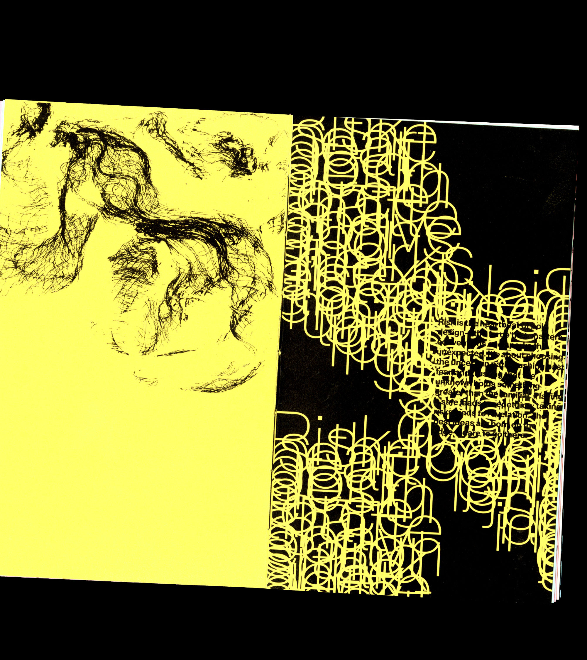

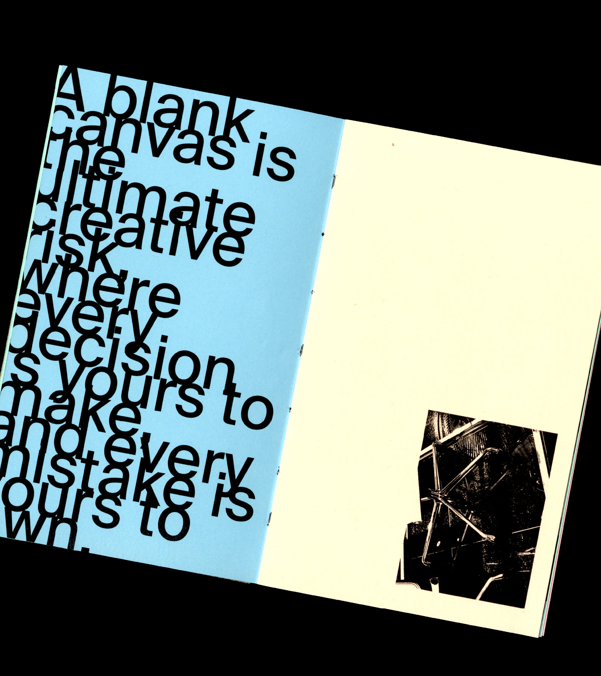
This project involved designing a publication for Dawson’s Graphic Design program, using the concept of risk-taking as its central theme inspired by personal experience. Each spread embraced experimentation through unconventional typography, disrupted grids, and expressive visuals, turning design itself into an act of exploration. The final piece reflects the program’s spirit of creative freedom while demonstrating how taking risks can push boundaries, foster originality, and transform communication into a more engaging and meaningful experience.

